Logo creation – Japan
Logo creation – Japan GC&Cie realized the graphic design of the Kishikawa Consulting Logo. A thorough research work has been realized to create a unique, strong and clear identity that shows precisely the image its Founder, Yasushi Kishikawa, wants to spread: . Professionalism, sobriety, simplicity, modernity: > A black modern, dynamic font has been chosen . As well as a solid, strong, confident, reassuring facet: >The font is quite thick and big comparing to the « K » initial of Kishikawa . A symbolic color for the Founder: the color of the « K » of Kishikawa: >Toulouse city pink, the city where he has founded his company. Pink is also a traditional color in Japan . The Japanese origin of the Founder without giving in the clichés of the red round, cherry trees or the crane, usually symbolizing Japan: > The « K » of Kishikawa has been designed under the shape of an origami . Kishikawa is underlined twice: once in black, once in Toulouse pink. The lines are not fully parallel : >Symbol of the dynamic commercial exchanges between France and Japan . Main service offered: the « Consulting » word is supporting the Founder’s name and the company in a clear way www.kishikawa-consulting.com You want to discover other logos we created ? CLICK HERE ! 🙂 Contact us for more information! 📧 gcavagnon@gccie.com 📱06 78 29 33 84 ***
2500 only ! Promotional Emailing campaign
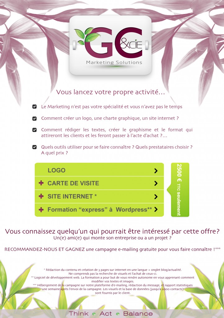
2500 only ! Promotional Emailing campaign In February, we launched a special offer for Start-Ups: 2500 euros only for the creation of a logo, a business card, a website and an express training on WordPress ! Emailing campaign results: Opening rate: 28,7% Clic rate: 1,8% Pretty good ! 🙂
Logo, Website, Social Media

Logo, Website, Social Media GC&Cie contributed to the International Marketing and Communication strategy of the Rosamon group and implemented operationally: . 8 logos for Rosamon group branches: Rosamon group, Rosamon Energia, Rosamon Trading…etc . Baselines creation for all logos . Realization of the letter-heads, powerpoints presentations, business cards… . Research of names for many products and product ranges (HelioCase, DiaRosa), registration of the names at the inpi . Launch of the solar panels range HelioCase at the Foire de Paris 2012 with the development of the ecommerce website: www.heliocase.com . Creation of a brochure for Rosamon Energia . Creation of a catalogue for cement machines : Cementeco . Creation certifications stamps for “Rosamon quality” and “Rosamon ethics” . Creation and community management: Facebook, Twitter For more information, check out the facebook pages of Rosamon Energia, HelioCase et GC&Cie: Facebook RosamonEnergia Facebook Heliocase Facebook GCcie Logos Rosamon Energia brochure in English Cementeco catalogue in English *** Contact us for more information! 📧 gcavagnon@gccie.com 📱06 78 29 33 84 ***
Bring Your Visual Identity To Life!
Bring Your Visual Identity To Life! Business Schools and the best Marketers repeated for too long that modifying a visual identity, even a little bit, was the worse thing to do and even almost criminal… Today, things changed. To a statu quo era, we are now in an evolutive and dynamic era, where information Tsunamis are part of our daily life. How can we keep prospects and clients attention ? How can we keep a young and dynamic image ? (who wants to work with people still living in an old era, praising statu quo and old habbits ???!!!???!!??) With COMMUNICATION ! And even with revamping your visual identity! First of all, whatever your industry, product or service is, you need to communicate to create, develop and maintain your Brand Awareness. Having great products and services is good. Making sure your target knows you exist is better. Obviously, according to your industry, products and services, you will not communicate the same way, with the same tools and most importantly you will not choose to show your creativity on the same collaterals. Creativity must be adapted on a case per case basis. One thing is certain: no innovation, no creativity some way or the other, gives your prospects and clients the image of a stagnating company or worse, a declining company. Statu Quo equals death! So, take initiatives and dare communicating! Your logo and graphic chart are your visual identity. The colors, the design, the words that describe you and with which your prospects and clients recognize you instantly. (this level of Brand Awareness happens after having created and communicated in a way or the other with a certain number of collaterals (e-mail, mailing, trade shows etc…)) Innovate once in a while, surprise and you will captivate your prospects and clients attention much better and in a very positive way. Taking initiatives, adapting, creating, innovating in communication give a very positive image as these are now the words which will be used by your prospects and clients to describe YOU ! As a Marketing and Communication agency, it is very easy for GC&Cie to allow itself more frequent and visible changes than a medical products company for instance. (which doesn’t mean this company cannot be innovative. Only the communication tools, the degree of modification and the frequency changes). So we let it go and enjoy being CREATIVE! And to wish you a beautiful Summer, we created a new logo. Hopefully this will inspire you! GC&CIE WISHES YOU A GREEN AND SPARKLING SUMMER! To see the 3 logos evolution in a bigger size: http://www.facebook.com/GCcie